Election Map, better
We give a hat tip to Vox and XKCD for an election map example that illustrates national election results far better than the versions we've typically seen.
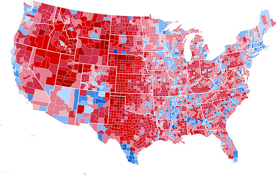
The most common red/blue map of Presidential election results looks something like this, from the 2000 Bush/Gore election.

Of course, ballots are cast by people – actual human beings – and not mere tracts of land. The map above radically overemphasizes the choices of sparsely populated areas.
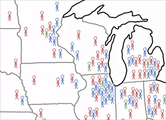
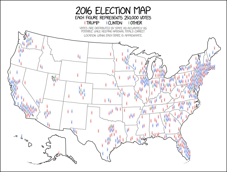
But over at XKCD, which bills itself as a webcomic of romance, sarcasm, math and language, there's a cleaner, more useful illustration, this one using the 2016 results.
The distribution of markers here makes sense geographically, and better exemplifies the near equal competition between Republicans and Democrats.

Our favorite part of the map? This version actually recognizes third party voters (here colored in green, for "Other"), a segment of the electorate that is consistently ignored by many in mass media. This bias – that third party voting is hardly worth mention, much less mapping – is a key ingredient in the mess of both politics and political coverage today.

